
Table of Contents
When you watch a film, ad, or YouTube video, the colors you see on screen aren’t just raw camera output. They’re carefully adjusted to set the mood, enhance storytelling, and make visuals look polished. This process is called color grading, and it’s one of the most powerful tools in video editing.
What Is Color Grading?
Color grading is the process of adjusting and enhancing the colors in a video to achieve a specific look, mood, or style. It goes beyond fixing technical issues; color grading adds creativity, emotion, and storytelling depth.
For example:
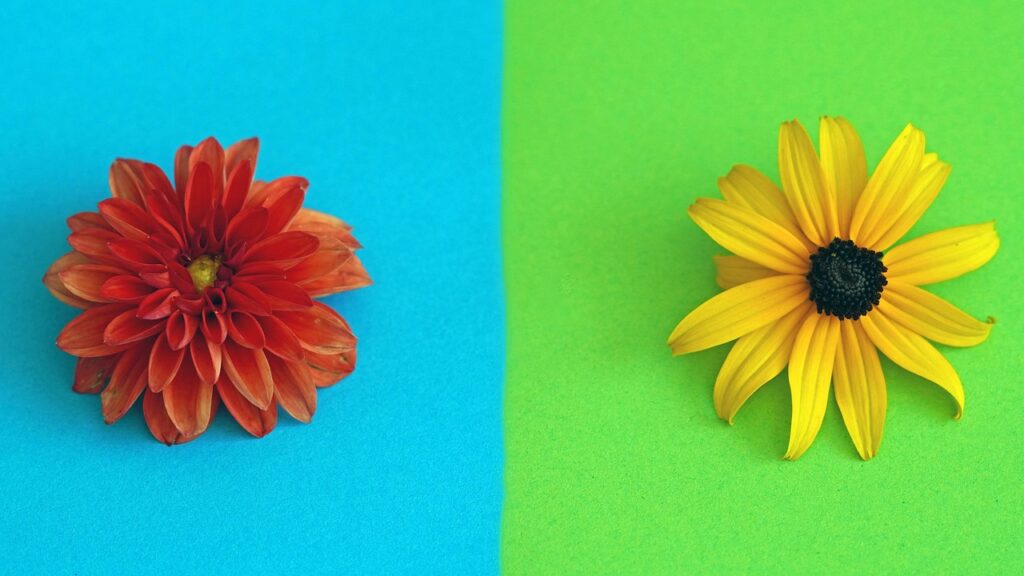
- Warm tones (orange and yellow) can make a scene feel cozy or nostalgic.
- Cool tones (blue and teal) can make a scene feel dramatic, futuristic, or tense.
- High contrast and saturation can make content look bold and energetic.
In short, color grading is like the final “makeup” of your video that gives it a professional, cinematic finish.
Why Is Color Grading Important in Video Editing?
Color grading does more than just beautify footage. It influences how your audience feels and engages with your video.
Here are a few reasons it’s essential:
- Sets the mood and atmosphere – Different color palettes can create suspense, joy, sadness, or excitement.
- Enhances storytelling – A shift in color can highlight changes in time, emotion, or location.
- Creates consistency – Color grading ensures all clips look uniform, especially when shot in different lighting conditions.
- Elevates professionalism – High-quality grading instantly makes videos look polished and industry-standard.
Color Correction vs. Color Grading
These two terms often get mixed up, but they’re not the same:
- Color correction is the first step. It fixes technical issues like exposure, white balance, contrast, and skin tones to make footage look natural.
- Color grading comes after correction. It stylizes the footage—adding mood, tone, and creative effects to achieve a cinematic feel.
Think of color correction as making your video look “real,” while color grading makes it look “memorable.”
Popular Color Grading Styles
Different types of grading are used depending on the project:
- Cinematic Teal & Orange – Widely used in films, balancing warm skin tones with cool backgrounds.
- Vintage Look – Desaturated, grainy, with faded highlights for a nostalgic vibe.
- High Contrast & Vibrant – Perfect for music videos and ads where energy is key.
- Muted Pastels – Soft, dreamy tones often used in lifestyle and travel content.
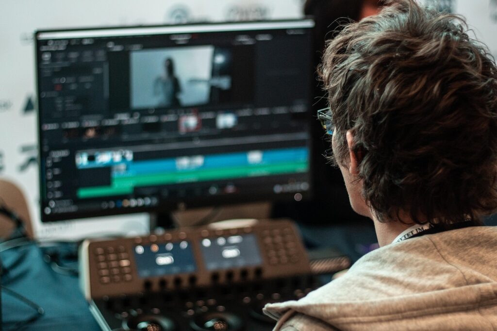
Tools and Software for Color Grading
If you’re starting out, here are some tools professionals use:
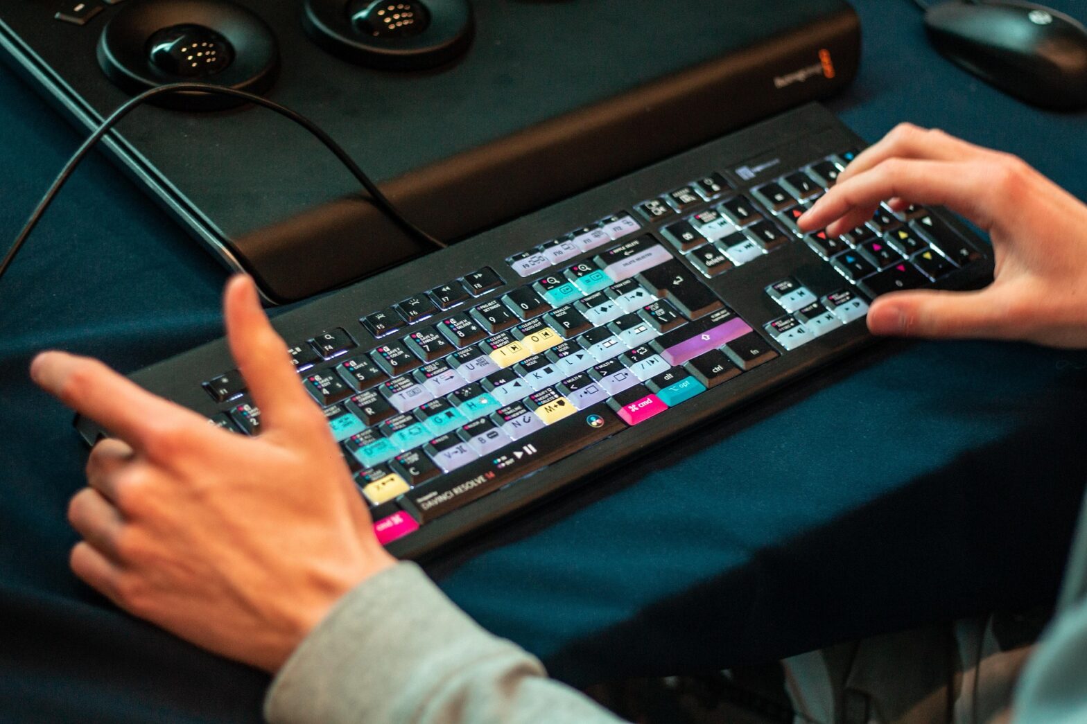
- DaVinci Resolve – Industry-standard for advanced color grading.
- Adobe Premiere Pro – Popular among creators, with Lumetri Color panel for grading.
- Final Cut Pro – User-friendly option for Mac editors.
- Filmora & CapCut – Beginner-friendly editors with built-in LUTs and presets.
Tips for Beginners in Color Grading
- Always start with color correction before grading.
- Use LUTs (Look Up Tables) to apply quick, professional looks.
- Pay attention to skin tones—they must look natural.
- Avoid over-saturation; subtle grading often looks more professional.
- Use reference images or films for inspiration.
Final Thoughts
Color grading is where technical editing meets creative storytelling. Whether you’re making YouTube content, short films, or brand videos, mastering grading will help your visuals stand out and resonate emotionally with viewers.
By learning the basics and practicing with tools like DaVinci Resolve or Premiere Pro, you can transform ordinary footage into eye-catching, cinematic visuals.